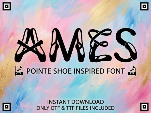
Ames: A Display Font That Commands Attention
It was 3:47 p.m. on a Tuesday—two days before the launch of our summer workshop series—and I was squinting at a split-screen preview: one side showed our Instagram post draft in Figma, the other a real-time mobile feed simulation. The headline felt flat. Not wrong, exactly—but forgettable. Like background music you don’t quite register. That’s when I swapped in Ames.
Instantly, the visual weight shifted. Ames isn’t just another decorative typeface—it’s a deliberate statement. Its bold, sculptural letterforms carry rhythm and attitude: subtle tapering strokes, confident curves, and intentional asymmetry that feels hand-drawn yet precisely engineered. It doesn’t whisper. It leans in. And in a feed where users scroll past content in under 0.8 seconds, that kind of presence isn’t optional—it’s strategic.
We used Ames across six core campaign assets that week: YouTube thumbnails, Pinterest pins, email banners, Reels cover frames, a Shopify homepage banner, and a set of printable workshop prep checklists. In every case, it anchored the message—not by being louder, but by being clearer. Ames works best for short, high-impact text: headlines, campaign labels (“Early Access”, “Live Now”, “New Drop”), quote callouts, and logo-style treatment for series names like “Summer Studio Sessions”. It’s not built for body copy or long paragraphs—and that’s its strength. It knows its role.
On mobile previews, Ames held up remarkably well—even at 28px on a 375px-wide canvas. Its generous x-height and open counters kept letters legible without sacrificing personality. We tested it over both light and dark backgrounds (a soft charcoal overlay on a sunlit photo, a crisp white lockup on deep navy), and it retained contrast and character each time. No pixelation. No ambiguity. Just immediate recognition.
That clarity translated directly to consistency. When our Pinterest pins shared the same Ames-styled header as the email banner and YouTube thumbnail, viewers didn’t need to reread the title—they recognized the voice. That’s how brand identity starts: not with a logo alone, but with repeatable, resonant typographic cues. Ames gave us that anchor point across platforms where design systems often fracture.
We paired Ames with Inter—a clean, highly readable sans serif—for all supporting text. The contrast worked beautifully: Ames brought energy and distinction; Inter brought calm, trust, and scannability. No competing personalities. Just smart hierarchy. For a more editorial feel—say, a blog post header followed by a pull quote—we tested Ames with a warm, low-contrast serif like IBM Plex Serif. Still strong. Still legible. Still unmistakably *us*.
What made Ames especially practical wasn’t just how it looked—but how it behaved. The font family includes multiple weights (Light, Regular, Bold), true italics (not slanted), and thoughtful OpenType features: discretionary ligatures for elegant “fi” and “fl” connections, alternate glyphs for a slightly more playful “a” or “g”, and multilingual support covering Western, Central, and South European languages. That meant no last-minute swaps when we added Spanish subtitles to our webinar promo video—or when a collaborator needed Greek characters for a bilingual Pinterest pin.
We also double-checked licensing before going live. Ames is a commercial font, fully cleared for use in digital ads, client-facing templates, Shopify themes, downloadable PDFs, and even limited-run merch (like workshop tote bags). No hidden restrictions. No surprise audits. Just straightforward, scalable permission—critical when your campaign assets live across owned, earned, and paid channels.
In practice, Ames shined brightest where attention is scarce and intention matters most: YouTube thumbnails (we used the Bold weight at 48px with tight tracking for maximum impact at thumbnail scale), Instagram Story stickers (its clean outlines stayed sharp even when scaled down to 20px), and email banners (where its vertical rhythm created natural breathing room above a CTA button). It never fought the image—it elevated it.
We didn’t use Ames everywhere. Our navigation bar, product descriptions, and footer links stayed in Inter. Our data-driven stats (“+42% engagement last season”) stayed neutral and numeric. Ames wasn’t the whole system—it was the spark. The signature. The moment the viewer pauses and thinks, “Oh—this is different.”
And that pause? That’s where meaning begins.
If you’re building a campaign around authenticity, creativity, or seasonal energy—whether it’s a limited-edition online shop drop, a speaker-led webinar series, a Reels-first content launch, or a Pinterest-driven product discovery push—Ames delivers more than aesthetics. It delivers clarity. It delivers cohesion. It delivers a voice that cuts through noise without shouting.
Just remember: Ames is a display font. Let it headline. Let it label. Let it declare. Then step back and let the rest of your design do the supporting work—with confidence, consistency, and quiet precision.
- Best for: Headlines, banners, thumbnails, social covers, quote graphics, campaign tags, logo treatments
- Avoid for: Long paragraphs, small UI labels, dense tables, accessibility-critical interface text
- Pair with: A neutral sans serif (e.g., Inter, Manrope), a warm serif (e.g., IBM Plex Serif), or a restrained script (for very selective accent use)
- Check before use: Included weights, language coverage, OpenType features, commercial license scope
- Real-world test tip: Preview at 50% scale on mobile—does the shape still read instantly?